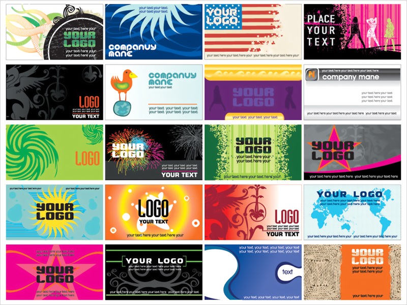
There are many links between good banner advert design and good web design, and many are often striving for perfection in both. The crossover comes as both need to communicate a strong message that can be converted into that business continuing a conversation with you and hopefully converting you into a customer or purchaser. And you see banner ads everywhere. So how can you ensure you stand out in the crowd? Here we outline ten key tips to give you banner ad success and maybe even some lessons you can apply on your site too.
1) Pair Strong Typography and Images
Strong banner ads join appropriate typography with images that are truly a pair and form an appropriate relationship in the viewer’s eye. So if you have playful images, choose a playful font, and use sophisticated fonts with matching images.
2) Use Hierarchy Effectively
Put your images front and centre and your typography alongside so it’s not lost, but the image is leading for you. They say a picture paints a thousand words, and nowehere is this more true than online.
3) Use Icons
You don’t always need to use photographic images, as hand-drawn or designed icons work just as well and can make an ad feel less like an ad with a personal touch.
4) Utilise the Unexpected
Occasionally, skipping the use of a typeface and writing out your message can work really well, especially if what you are trying to convert is something more personal – in a a recruitment ad, for example, or anywhere you want to be less intimidating.
5) Use Illustrations
It’s an easy way to incorporate fun into your ads. You can achieve a variety of looks with illustrations that are edgy or friendly and everything in between.
6) Switch Your Layout
Make sure you design in the main size you’ll be working with, but adjust appropriately for other formats. Keep working until you perfect it.
7) Colour Is King
Colourful ads really draw your eye in. Incorporate colour ads to help them stand out in a sea of monotone.
8) Keep It Simple
Don’t cram your ads full of information that would be better communicated on your site. Sometimes all you need is product information, your logo and a short description.
9) Keep Up to Date
Ads that are relevant and incorporate pop culture references will show your audience you are on the ball – watch the news and look for angles you can use in your ads. And if you’re still struggling, then think about how a web design company can help to guide you through the maze of web and banner ad design. A good business will always be on the ball regarding market developments and will offer advice first, so take them up on it.
10) Remember Your Target Audience
Remember above all who you are trying to appeal to and what their needs are. Make sure your images, text and typography are all relevant to the product you are promoting and you can’t go far wrong.
Hopefully, we’ve given you some food for thought. Many of these hints will also work across your website design too. Think about how you can make a truly integrated ad and site experience and you can’t go far wrong. There will always be hideous ad examples, but if you incorporate our tips, you’ll be on the road to banner ad success in no time, and those bad ads will simply be white noise.


