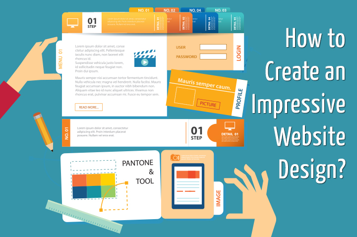
Start-ups are progressively popping up everywhere. The youth today is no longer interested in joining renowned brands and giving their whole life to the 9-5 job. They are more ambitious and want to create their identity even if they have to take a huge risk. Nevertheless, in most of the cases, these young business minds don’t have any proficient designer or developer with them and this could be the reason why most of the start-ups websites look so stale, if not completely boring. This is a direct indication that they won’t be able to make their mark in the online world. So, it is quite important for them to pay attention to the look and feel of the startup design, which will make a lasting impression on visitors and convert them into customers.
Below mentioned are some sound tips that will help you to put your website design in order:
1) Make a Simple Approach : As most of the start-ups don’t have in-depth idea about the designing part, they simply stuff their website with plenty of unnecessary designing elements and graphics. They are likely to believe that these additions will look impressive to the visitors, but the actual picture is far apart. There is a very famous saying that ‘Less is more’. This is applicable to the web design. You just need to incorporate the requisite elements including creative logo, simple navigation; high-quality images search field and a button for Call to Action.
2) Website Flow and Perceivable Hierarchy : You need to structure your website with a proper hierarchy otherwise it could be a case that people take an exit without even noticing the important sections of the website. Perceivable Hierarchy means highlighting the sections as per their importance for example – you can keep the Call to Action buttons larger than that of read more button. The content of the header tag should be bigger than that of body content.
Coming on to the flow, the user’s journey through the site should not be interrupted in any instance. You cannot ask people to make a click every time they want to view some information as this indicates interrupted flow. Cut down the steps of signing in and signing out steps, you will notice a dramatic improvement in the user’s browsing experience.
3) Use Minimum Variations of Font: It is just not sensible to use any font because you like it. Some fonts don’t look professional at all. Precisely, you should avoid using more than two font at any specific point of time especially when you are designing a website. As the most start-ups have no idea about appropriate web design, they make use of multiple fonts and spoil the aesthetics of the design. Therefore, you should choose a font that is professional and have good readability.
4) High-Resolution Images: Make sure that you are using good quality images. Using meaningless or low-resolution images in website could seriously ruin your venture’s prospect. Though the use of stock photography was quite popular in the web but it is not very much effective in catching the attention of the viewers. It is preferable that you use striking, unique and good resolution images so that you can reflect your business ideology to the target audience in an effective manner.
5) Call to Action: If you do not give proper indications, how will people explore your website thoroughly? Moreover, what would they be doing when they wish to buy a product? Instead of putting customers into perplexing situations, guide them by providing proper CTA buttons like buy now or contact us so that they can make their purchase or can contact you whenever they encounter any issue in selection or making payments. Hence, incorporate such buttons in your design in order to increase the conversion ratio.
6) Mobile Friendly: Make sure your website is running flawlessly even on mobile devices as people today rely on their mobile devices for all their online activities be it banking, shopping or browsing. Making your website compatible with mobile platforms is an easier way to reach your potential customers.
This tutorial is worth reading if you are also planning to set-up your business and want to design a striking website design.
Author Bio
Kristy Bernales, currently working as lead User Interface Designer at Melbourne Web design Company – webdesignxperts.com.au, has posted this tutorial for the newbie start-up owners so that they can make a striking online identity with the very first glance of their website. Connect her on FB & Twitter to know more.


